Cheerios Rebrand
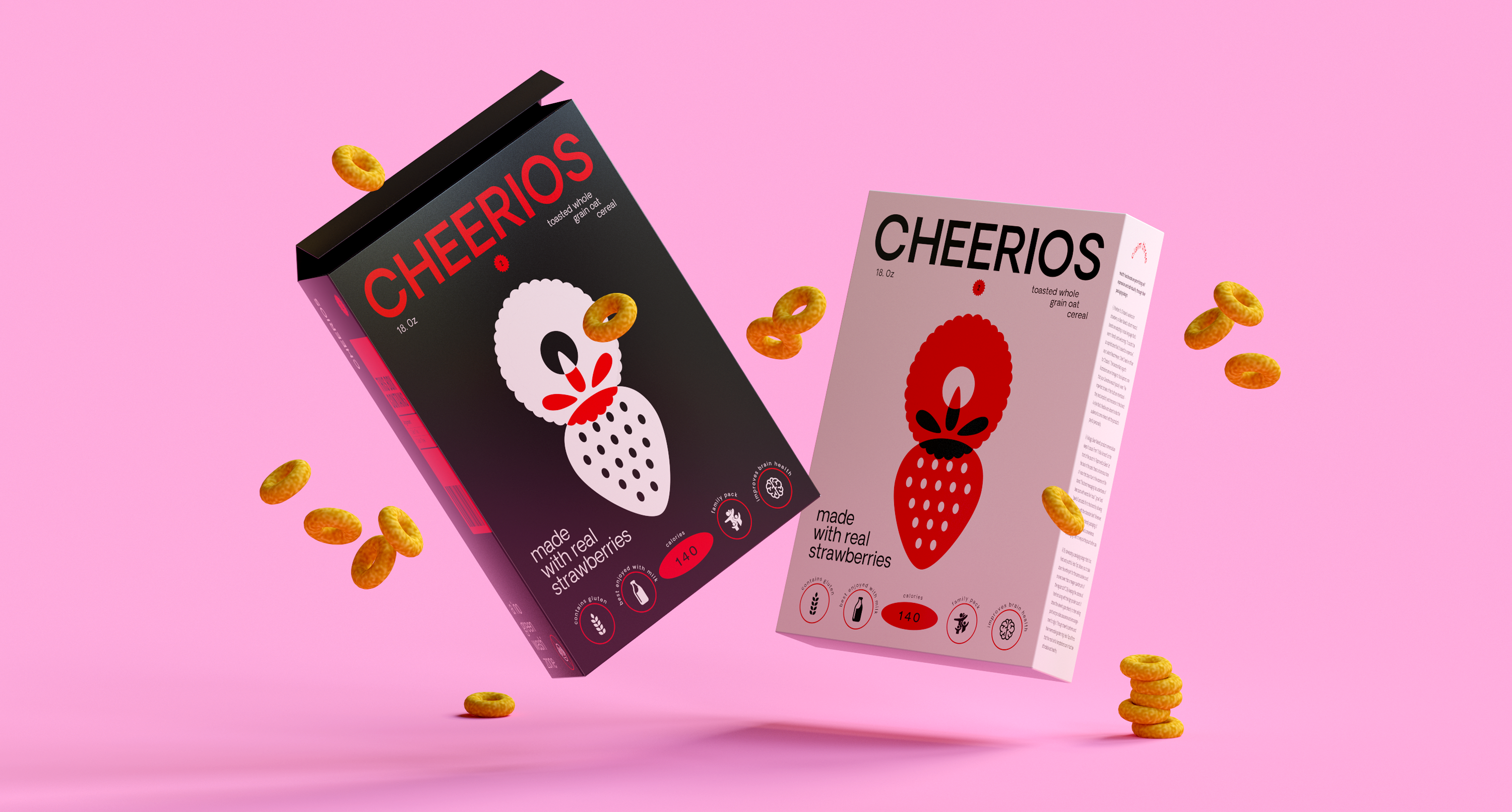
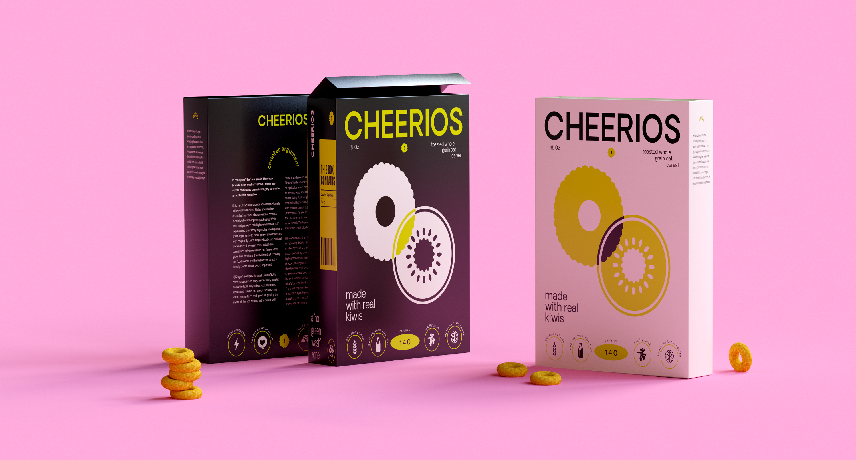
Packaging Design for Cheerios cereal which employs a functional, ‘no-BS’ approach and chooses honest communication over misleading its audience. Having its own distinct personality, it uses bold symbols and functional typography to rebel against the tired visual language that we see in the cereal section of any grocery store. The intentional ‘overlap’ stands for full transparency and zero fluff.
Research & Analysis, Packaging Design,
Visual Language, 3D Mockups
Mentor: Michael Mikulec︎︎︎(Chair of Graphic Design &
Visual Experience at Savannah College of Art and Design)
Year of Completion: 2021
Visual Language, 3D Mockups
Mentor: Michael Mikulec︎︎︎(Chair of Graphic Design &
Visual Experience at Savannah College of Art and Design)
Year of Completion: 2021