The Wendy’s Story
Typographic Voice and Visual Narrative for Wendy Thomas (Melinda Lou Thomas-Morse), the namesake and mascot of the fast-food restaurant Wendy’s. While her father Dave Thomas may have been the founder, Wendy Thomas has been the face of the brand for 50 years.
In this project, I’ve explored type forms through the lens of both the brand and the individual, Wendy Thomas. They draw references from her attributes such as the iconic red braids, American retro fast-food experience and the essence of food and their textures in general.
In this project, I’ve explored type forms through the lens of both the brand and the individual, Wendy Thomas. They draw references from her attributes such as the iconic red braids, American retro fast-food experience and the essence of food and their textures in general.
Typography, Visual Narrative, Photography, 3D Design,
Layout, Newspaper Design
Mentor: Sohee Kwon︎︎︎(Professor of Graphic Design &
Visual Experience at Savannah College of Art and Design)
Year of Completion: 2021
Layout, Newspaper Design
Mentor: Sohee Kwon︎︎︎(Professor of Graphic Design &
Visual Experience at Savannah College of Art and Design)
Year of Completion: 2021
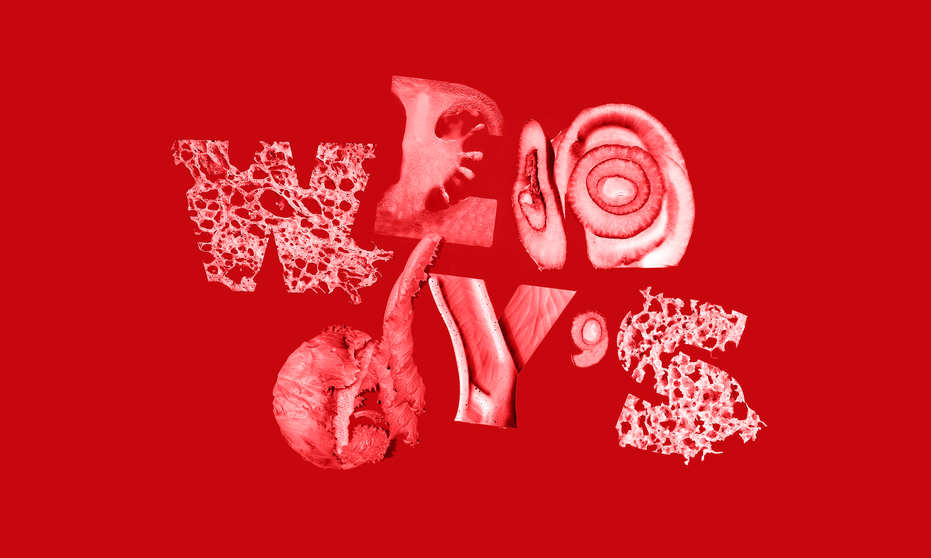
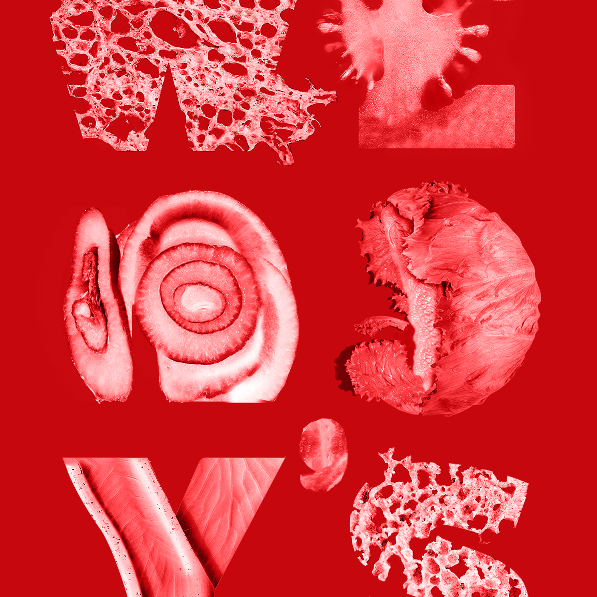
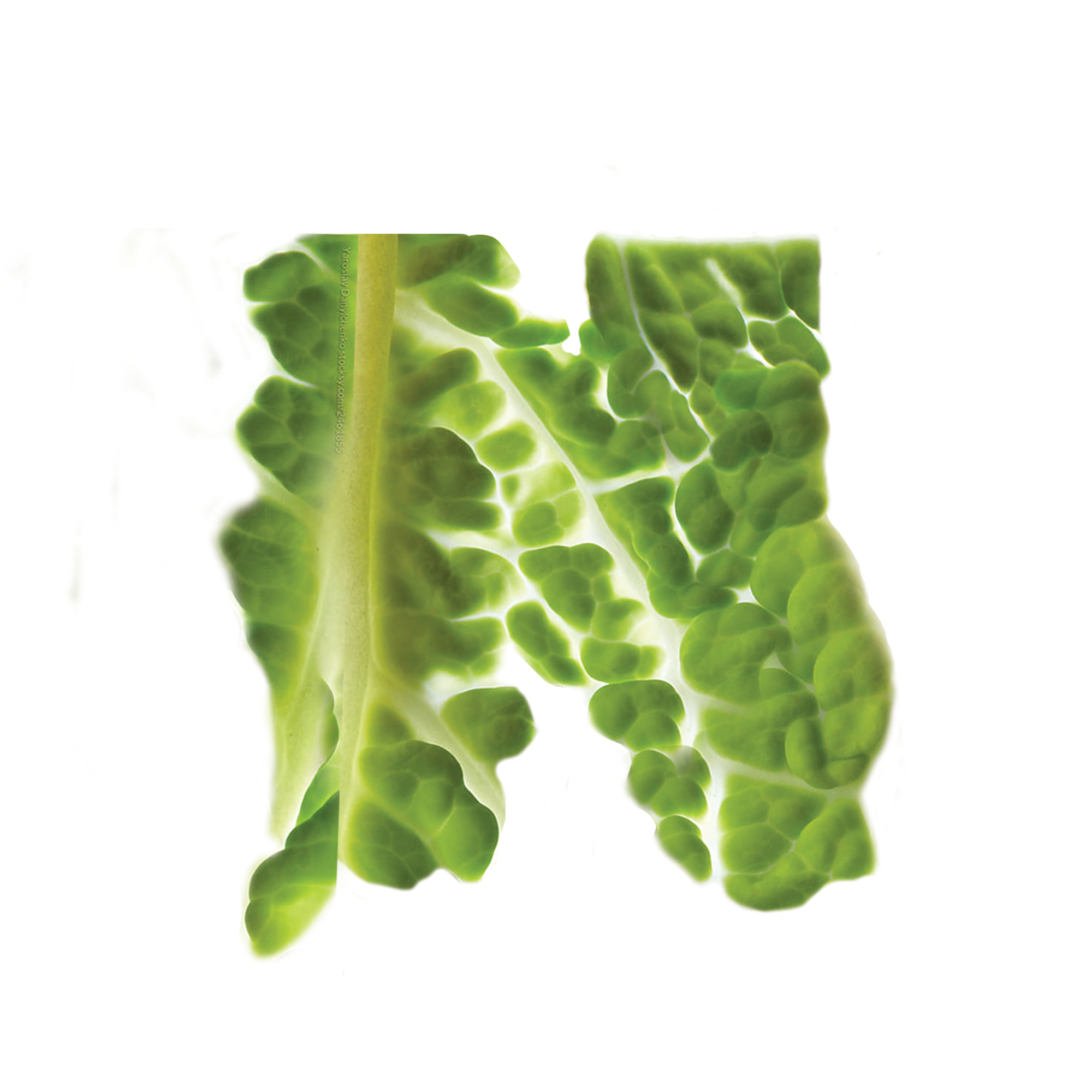
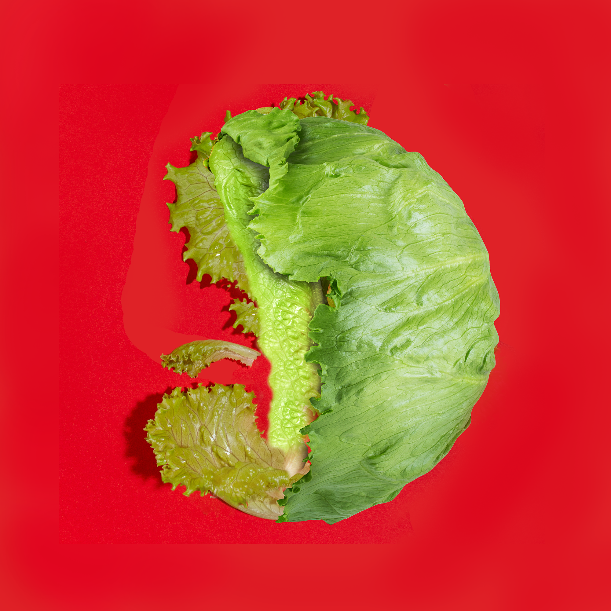
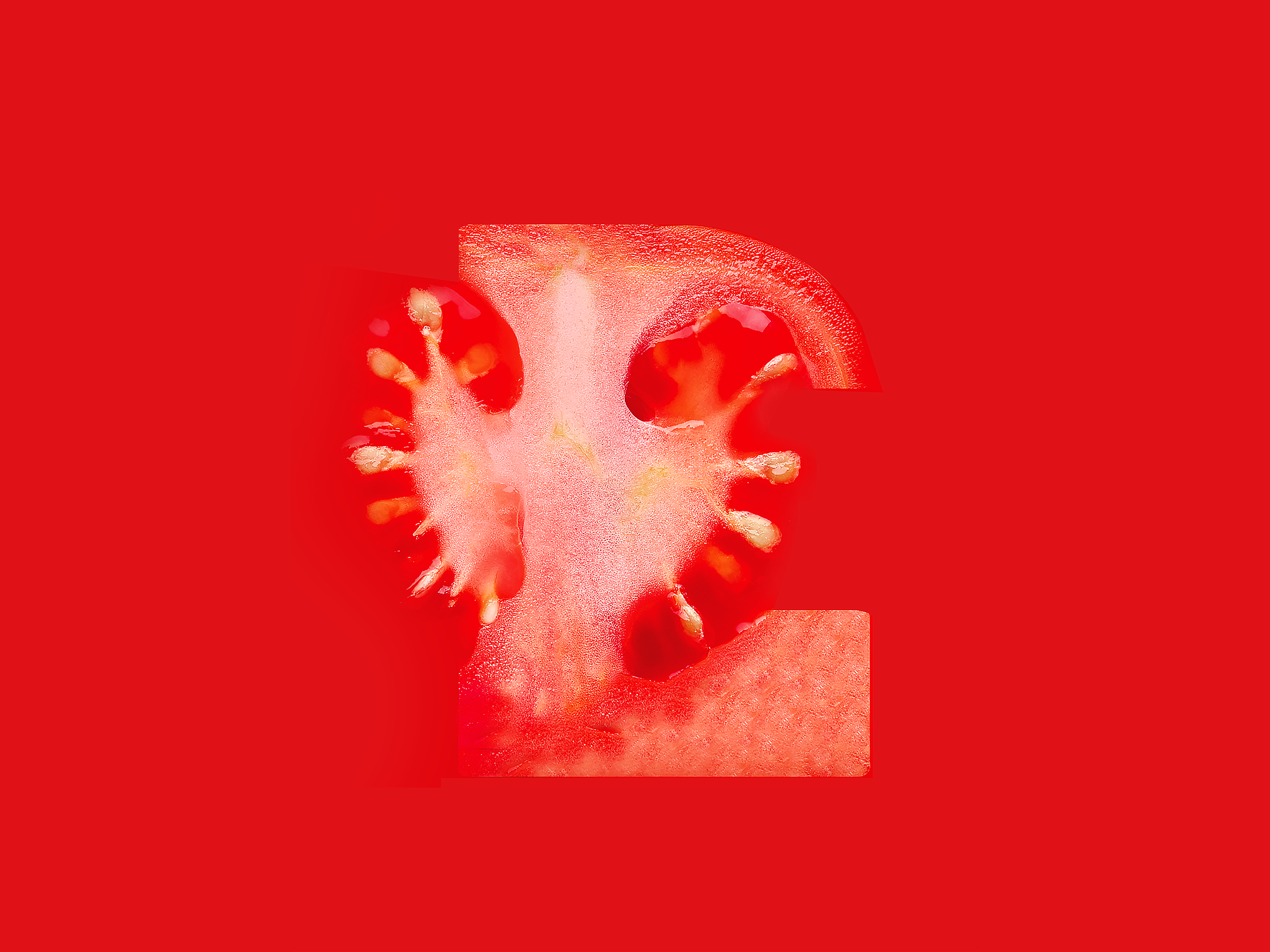
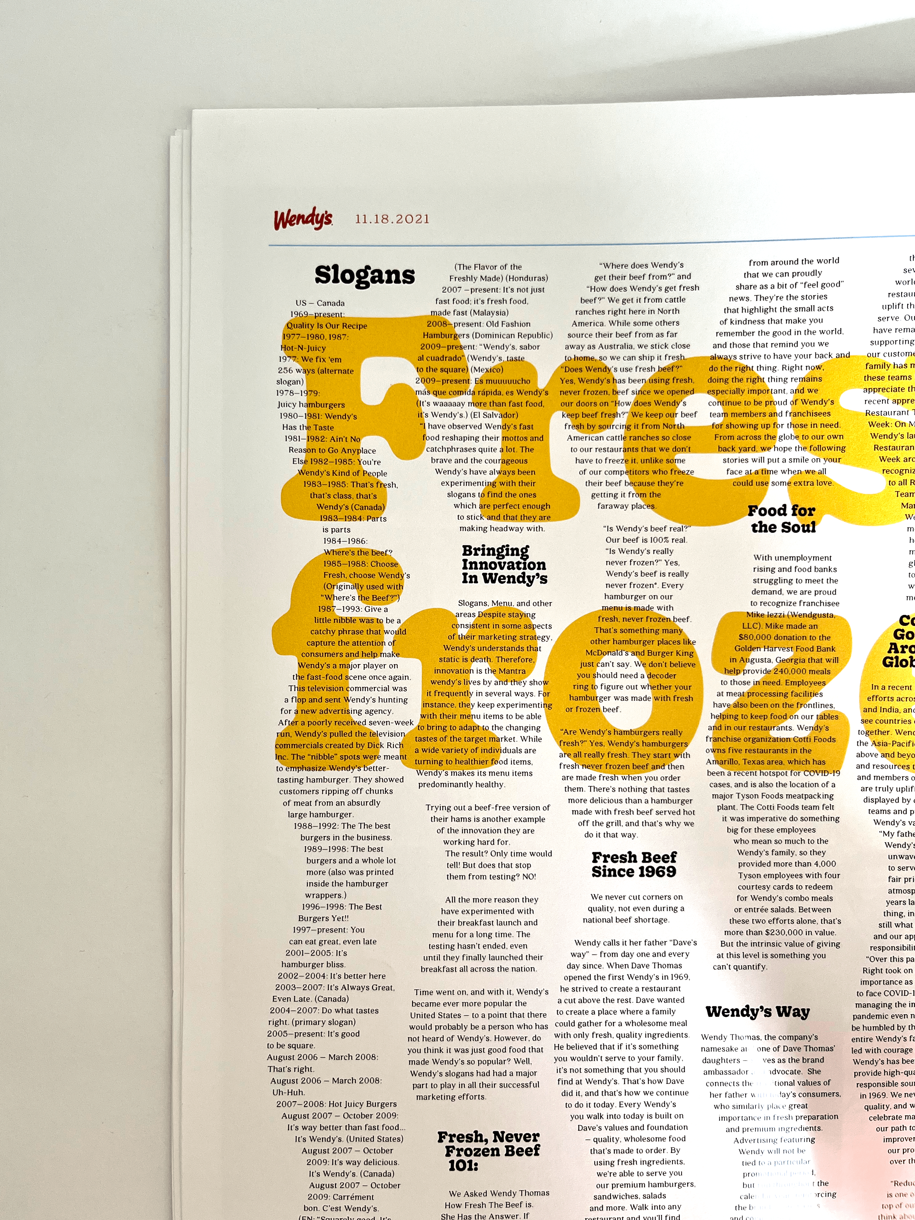
1. Wendy’s
Drawing inspiration from a messy ‘kitchen-top’, this composition
represents a deconstructed sandwich. It sees a blend of each
typeform with specific textures of ingredients.



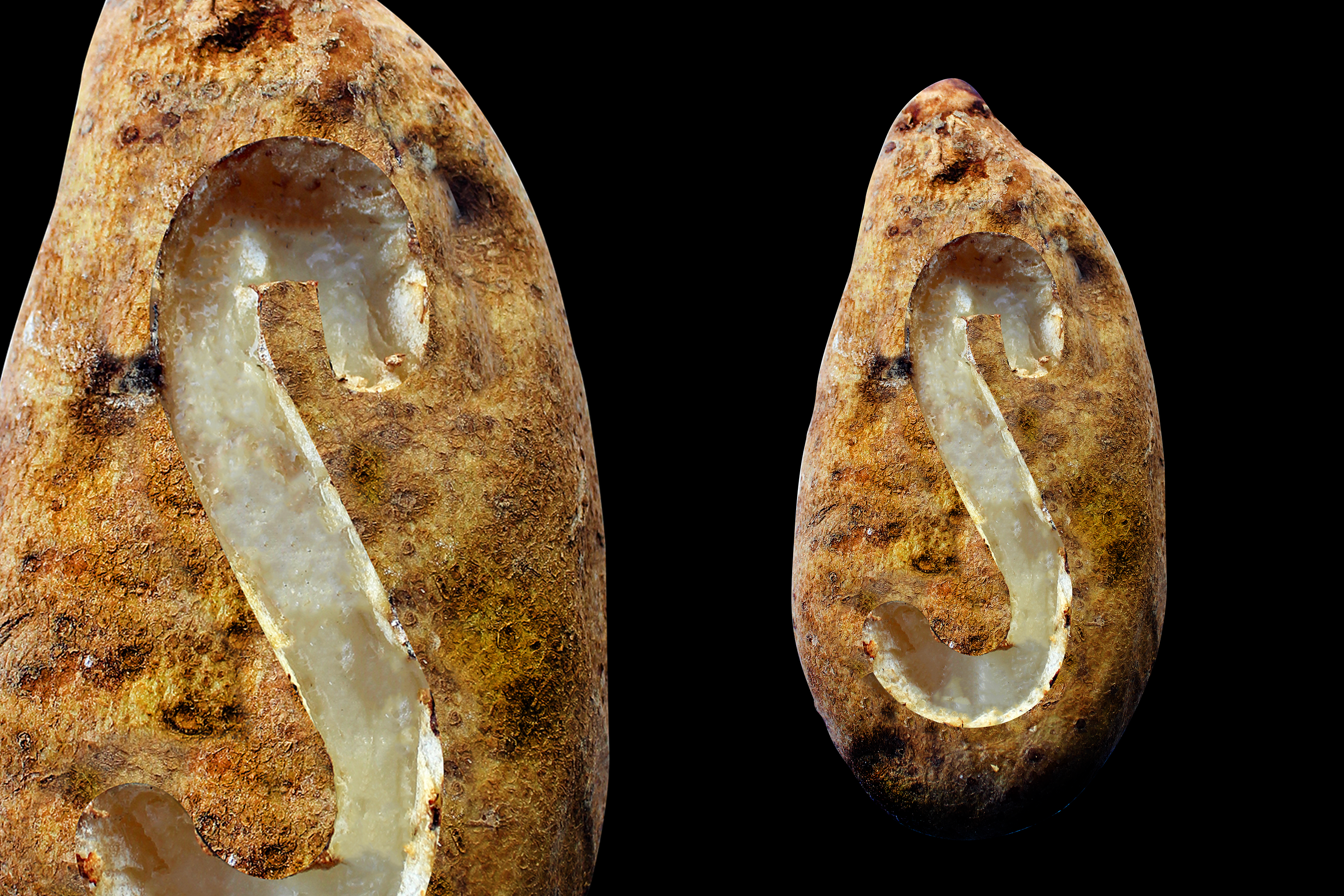
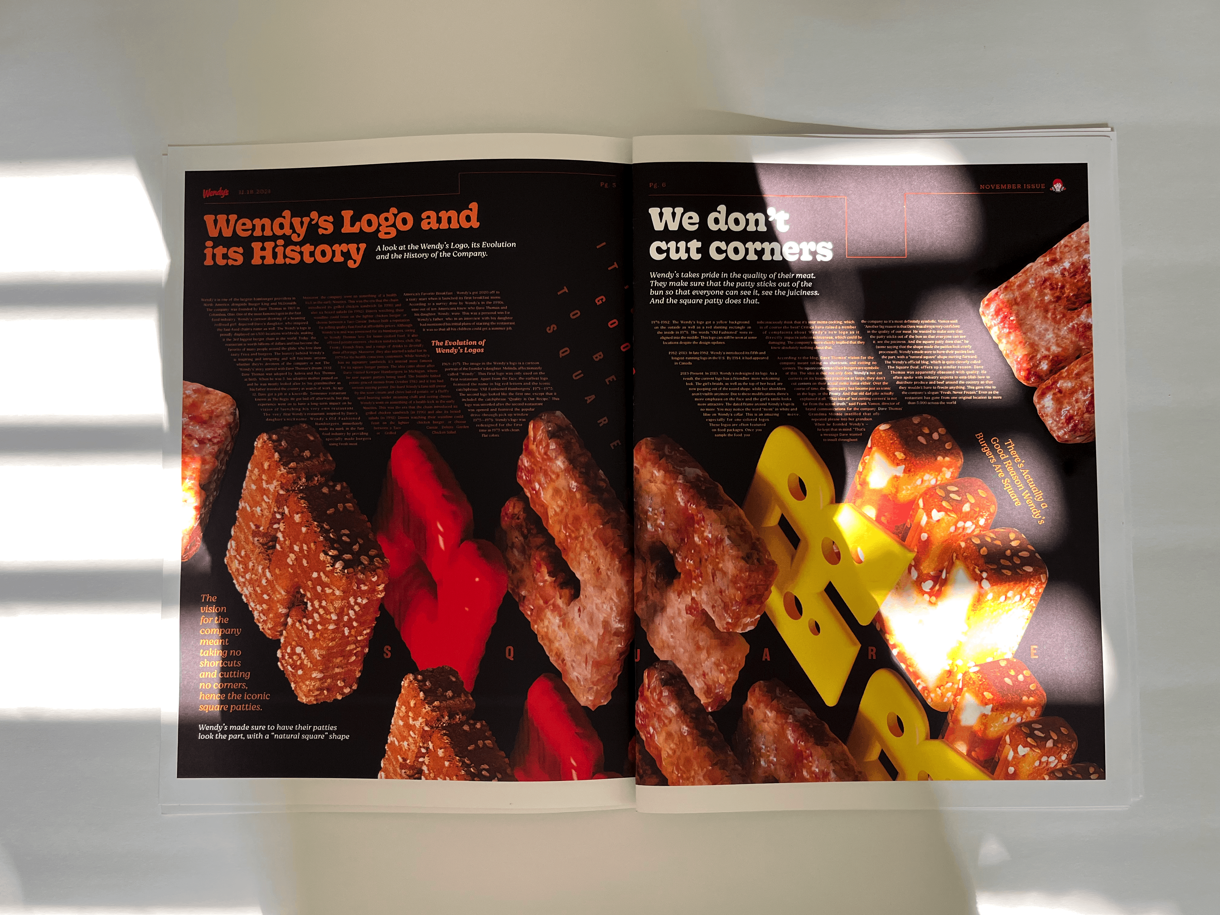
2. Square
Wendy’s vision was (and still remains to this very day) taking no shortcuts
and cutting no corners. The 3D square letterforms are symbolic of this idea.
As Wendy’s rightly says, ‘It’s Good to be Square’.


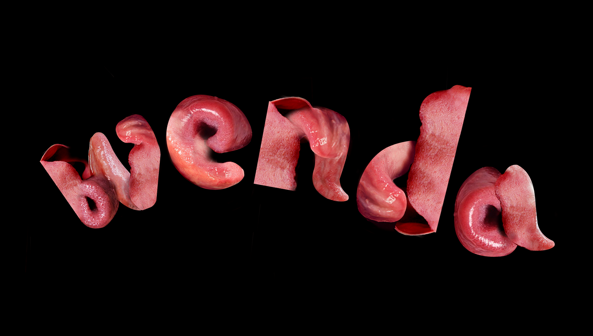
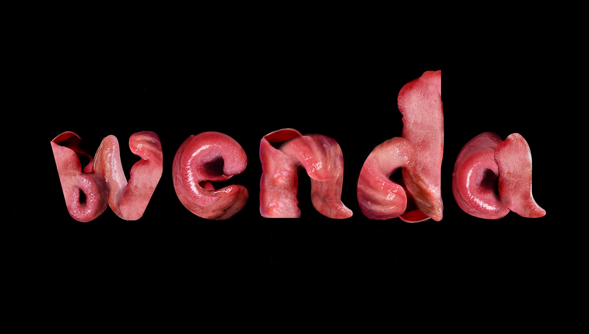
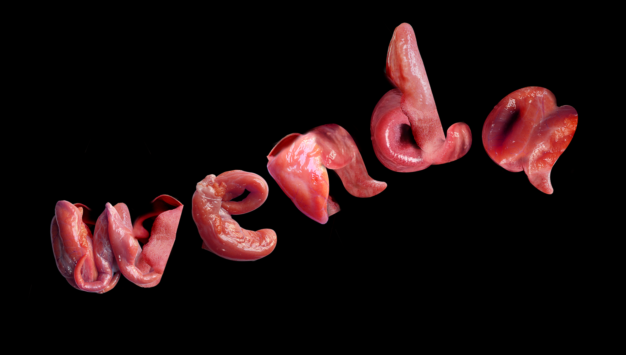
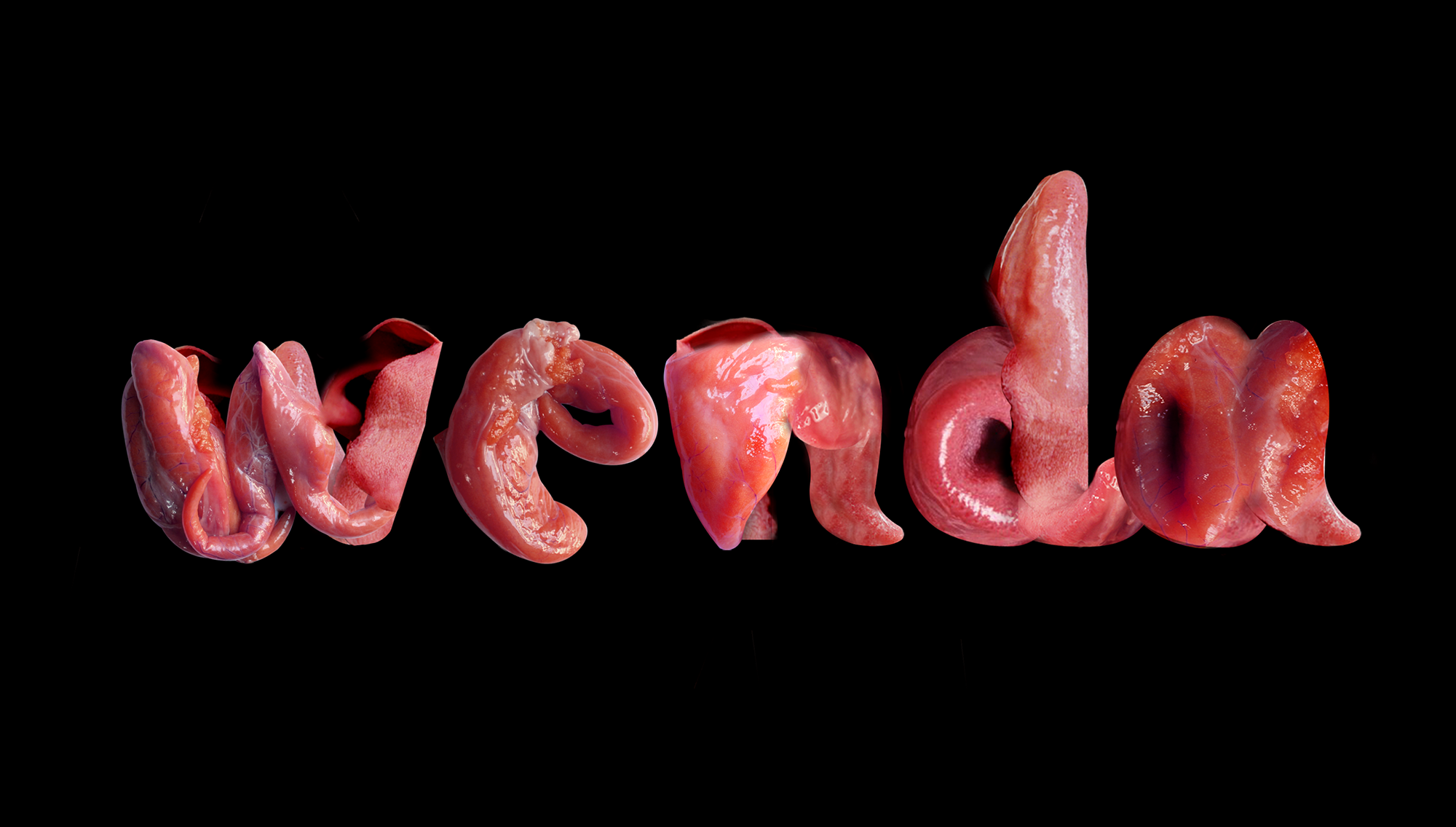
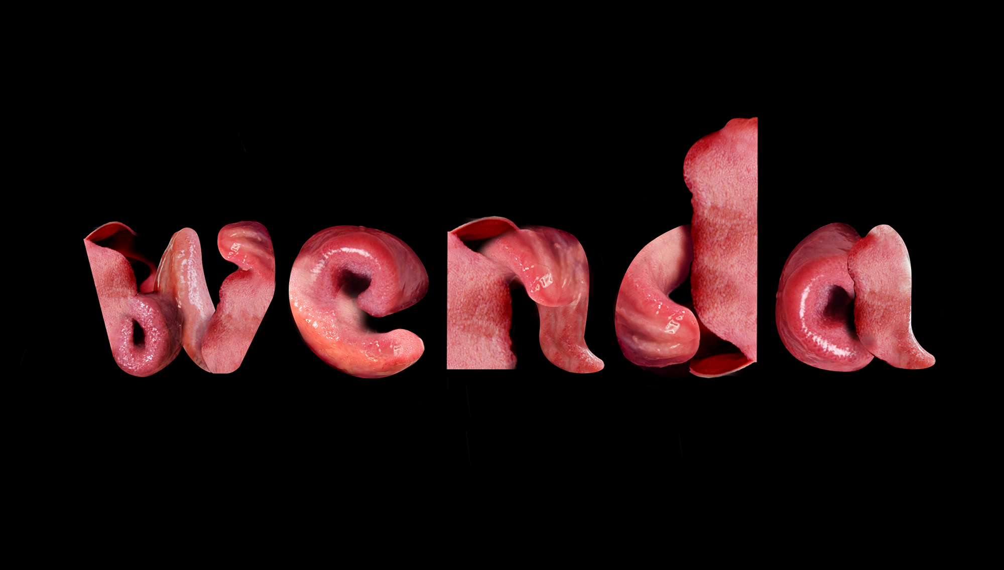
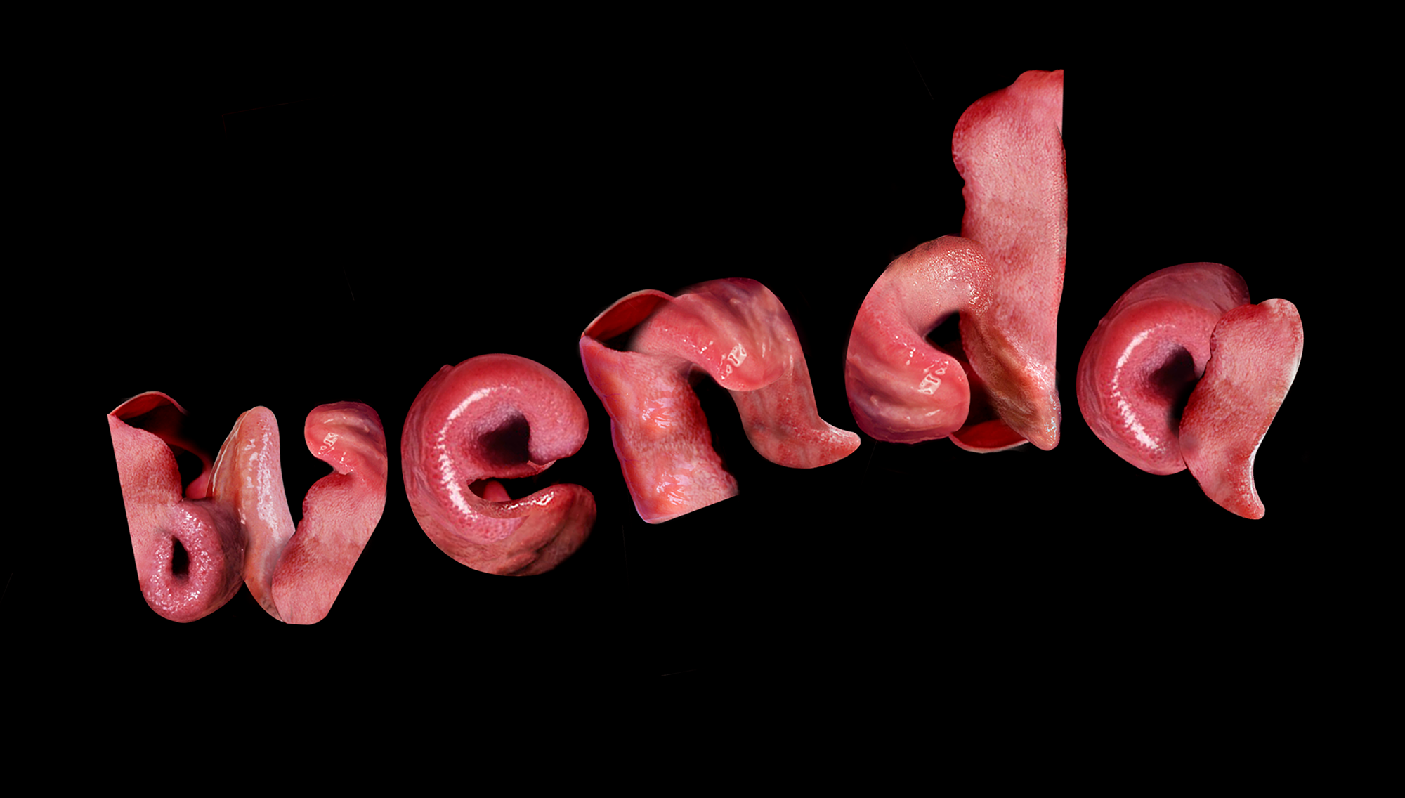
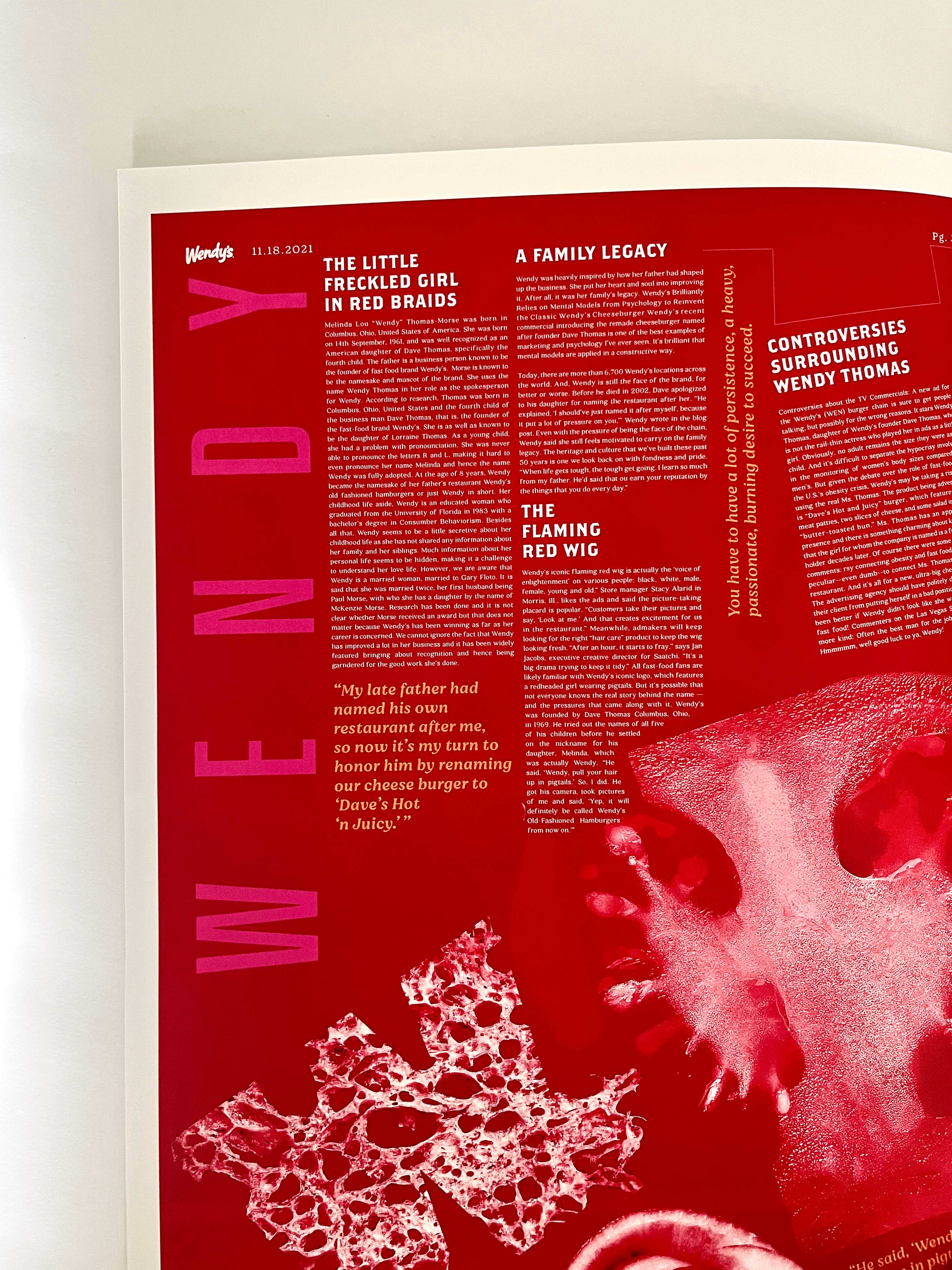
3. Wenda
As a young child, Wendy Thomas had a problem with pronunciation.
Unable to pronounce the letters R and L, and would say her name as
‘Wenda instead of Melinda. The tongues used in this composition are
symbolic of that idea and create each letterform meticulously.

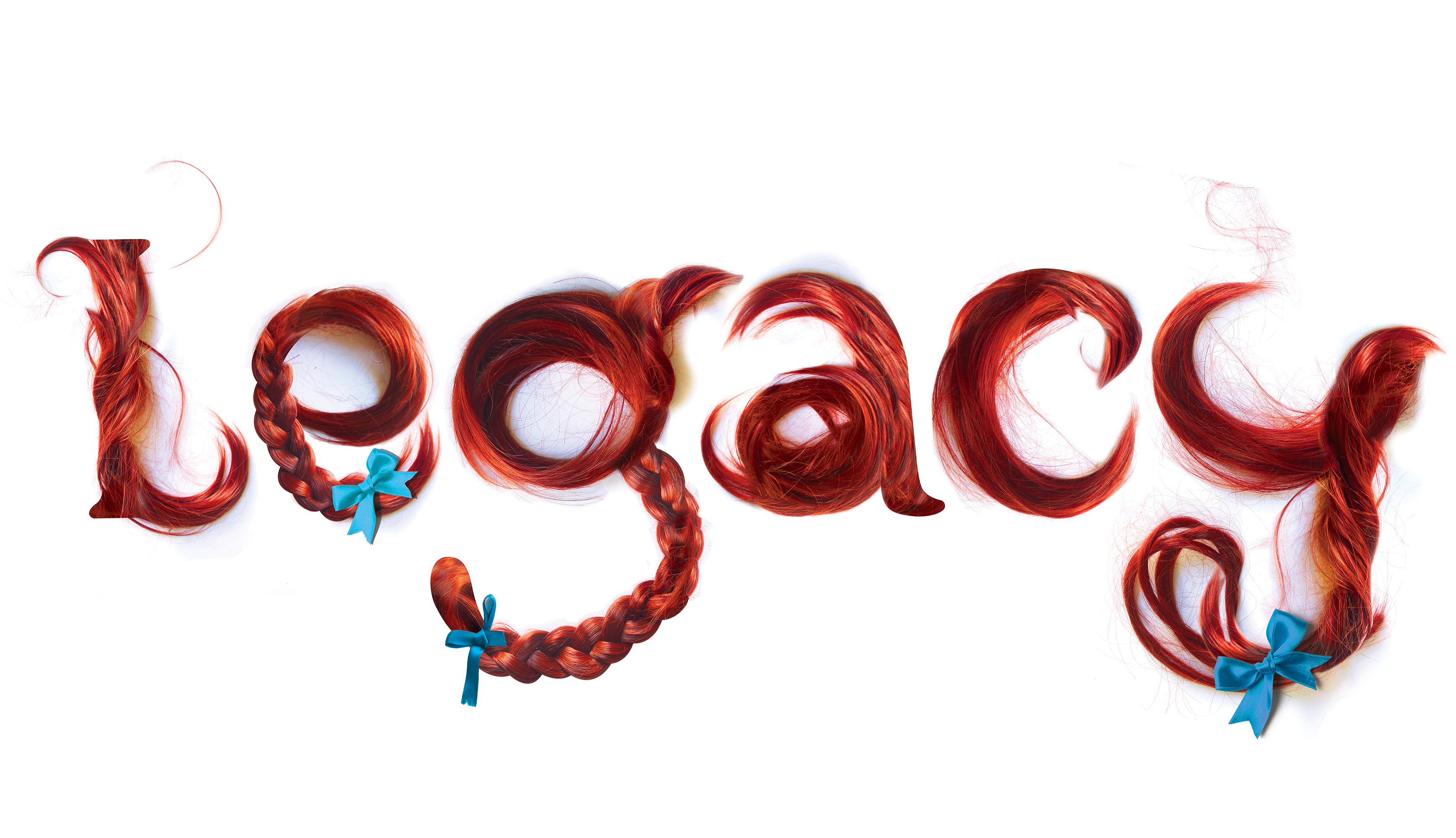
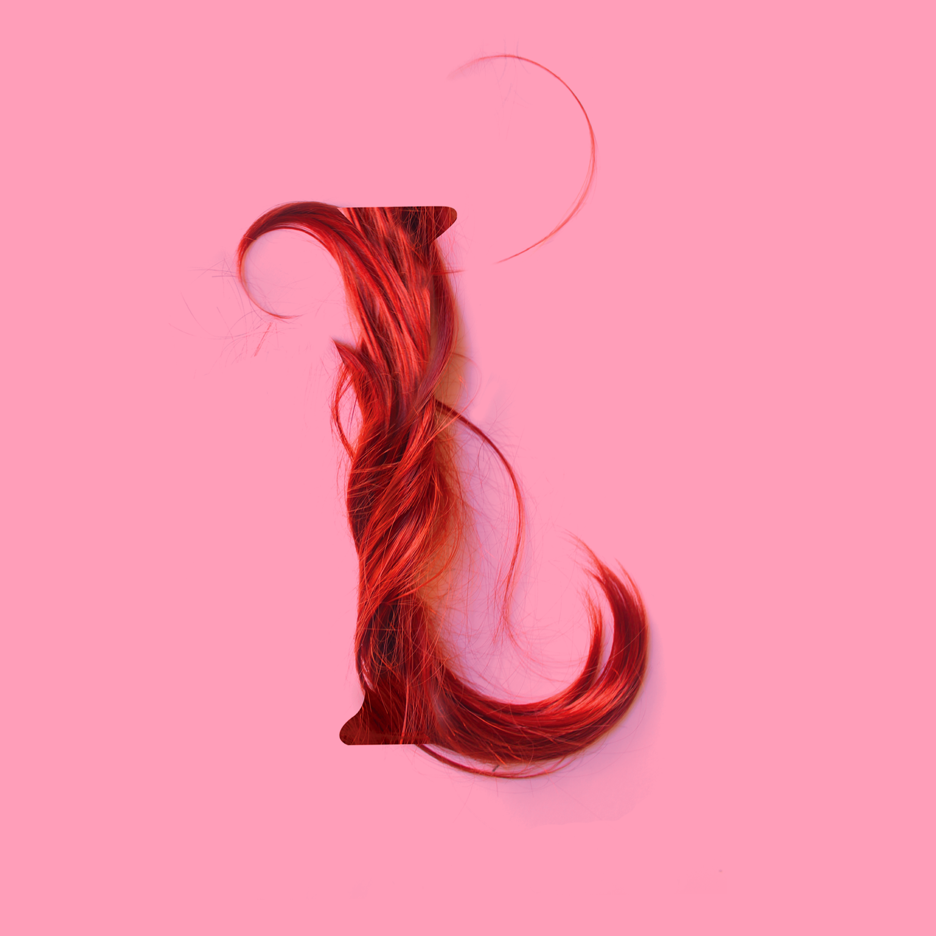
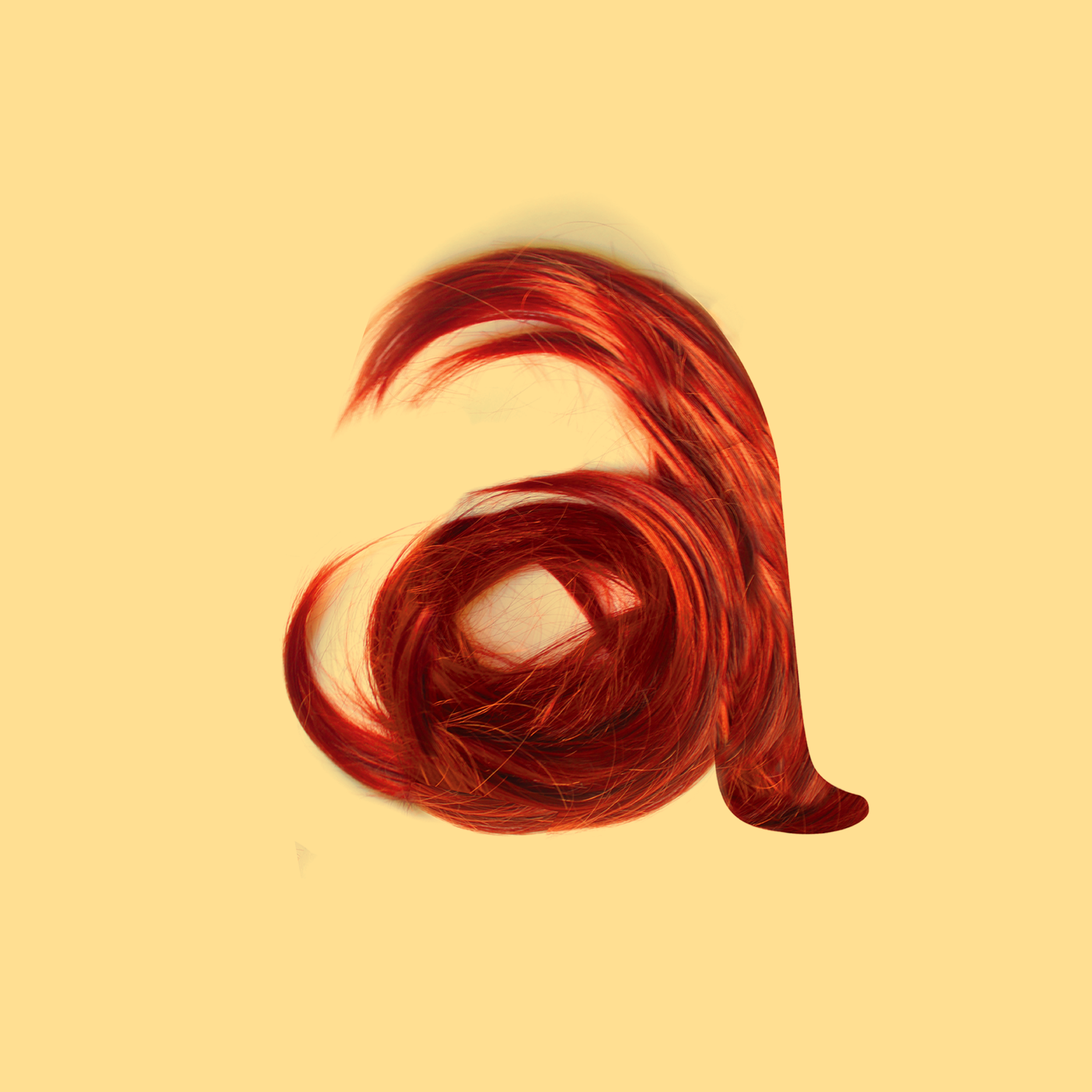
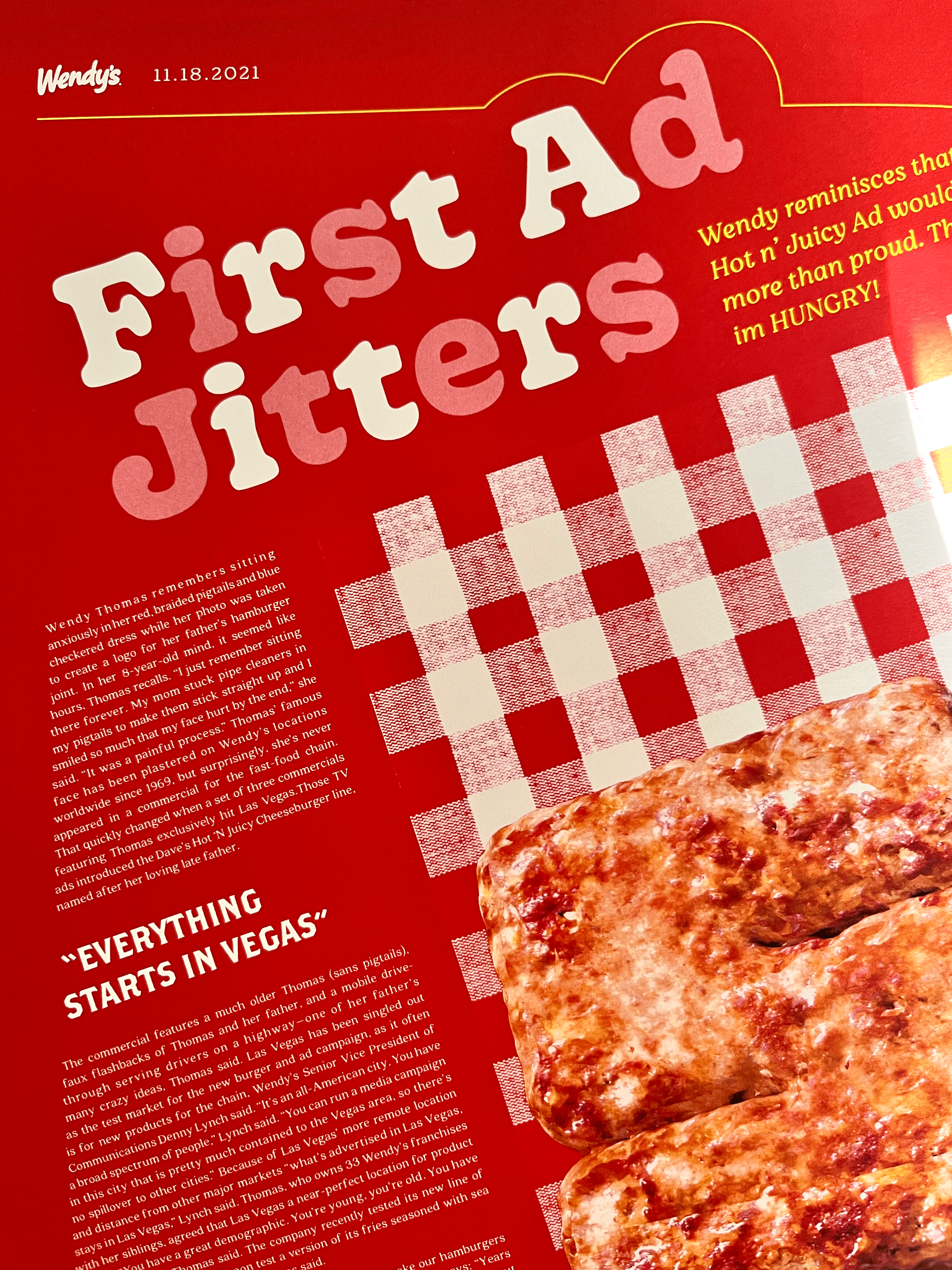
4. Legacy
Wendy’s story began with founder Dave Thomas asking his daughter to
“pull her hair up in pigtails.” He got his camera, took pictures of the little freckled
girl and said, “Yep, it will definitely be called Wendy’s Old-Fashioned Hamburgers
from now on.” That was the start of a family legacy.

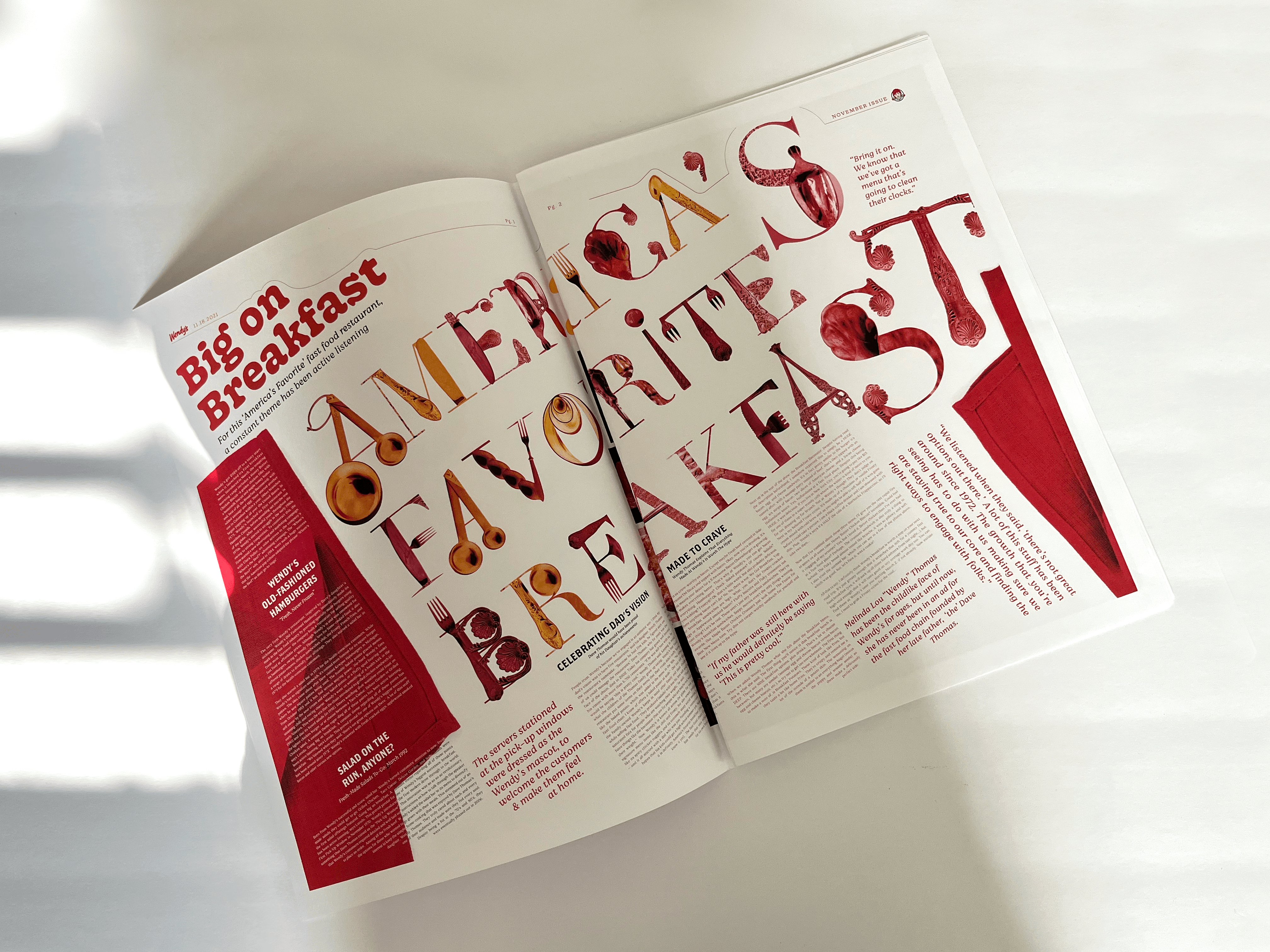
5. America’s Favorite Breakfast
Wendy’s has always been big on breakfast. This composition takes us
back to America in the 60s with its characteristic cutlery.


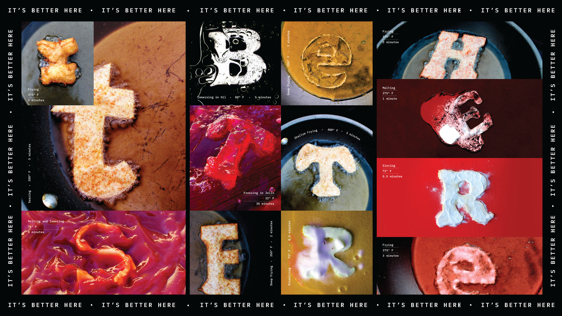
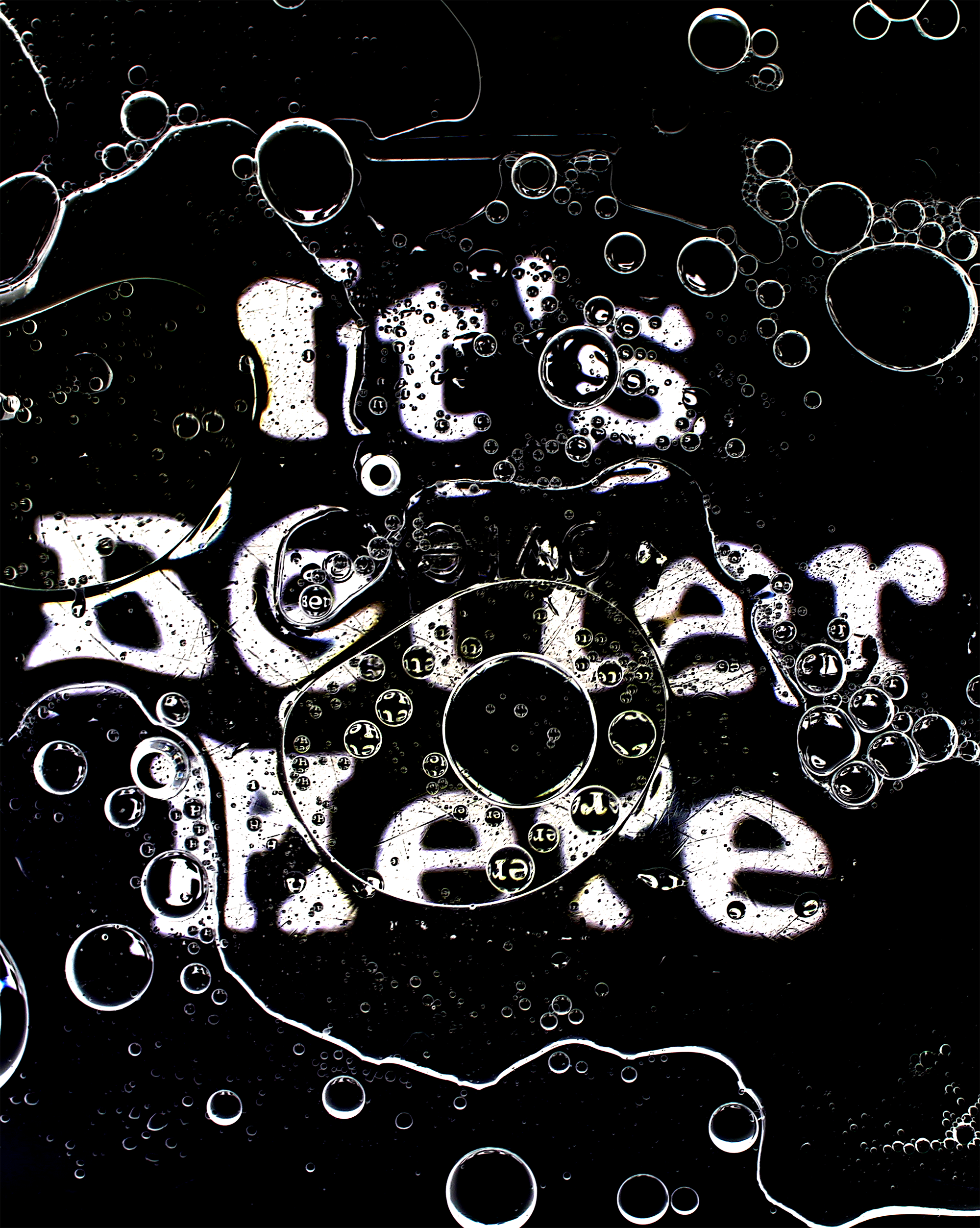
6. It’s Better Here
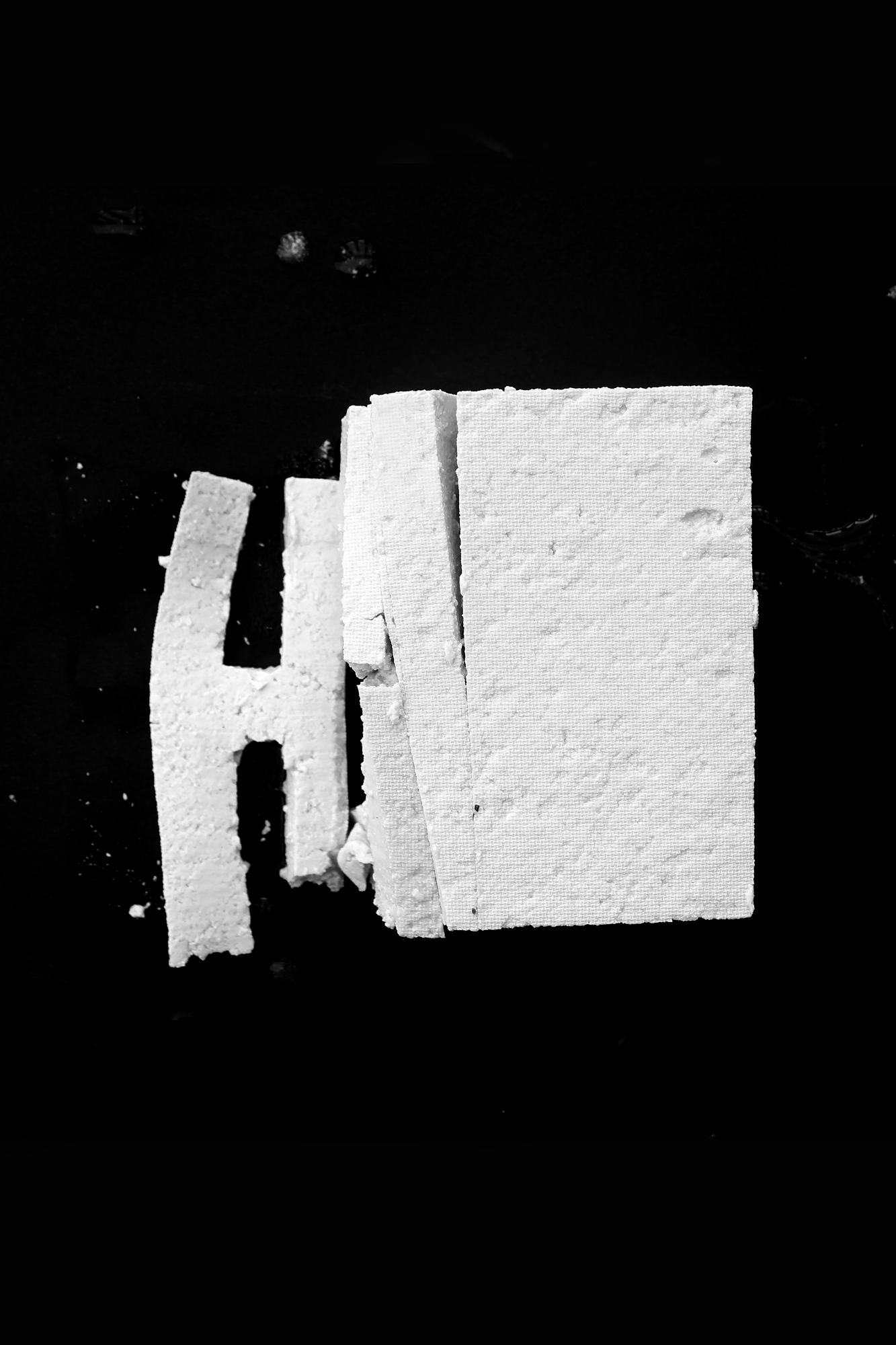
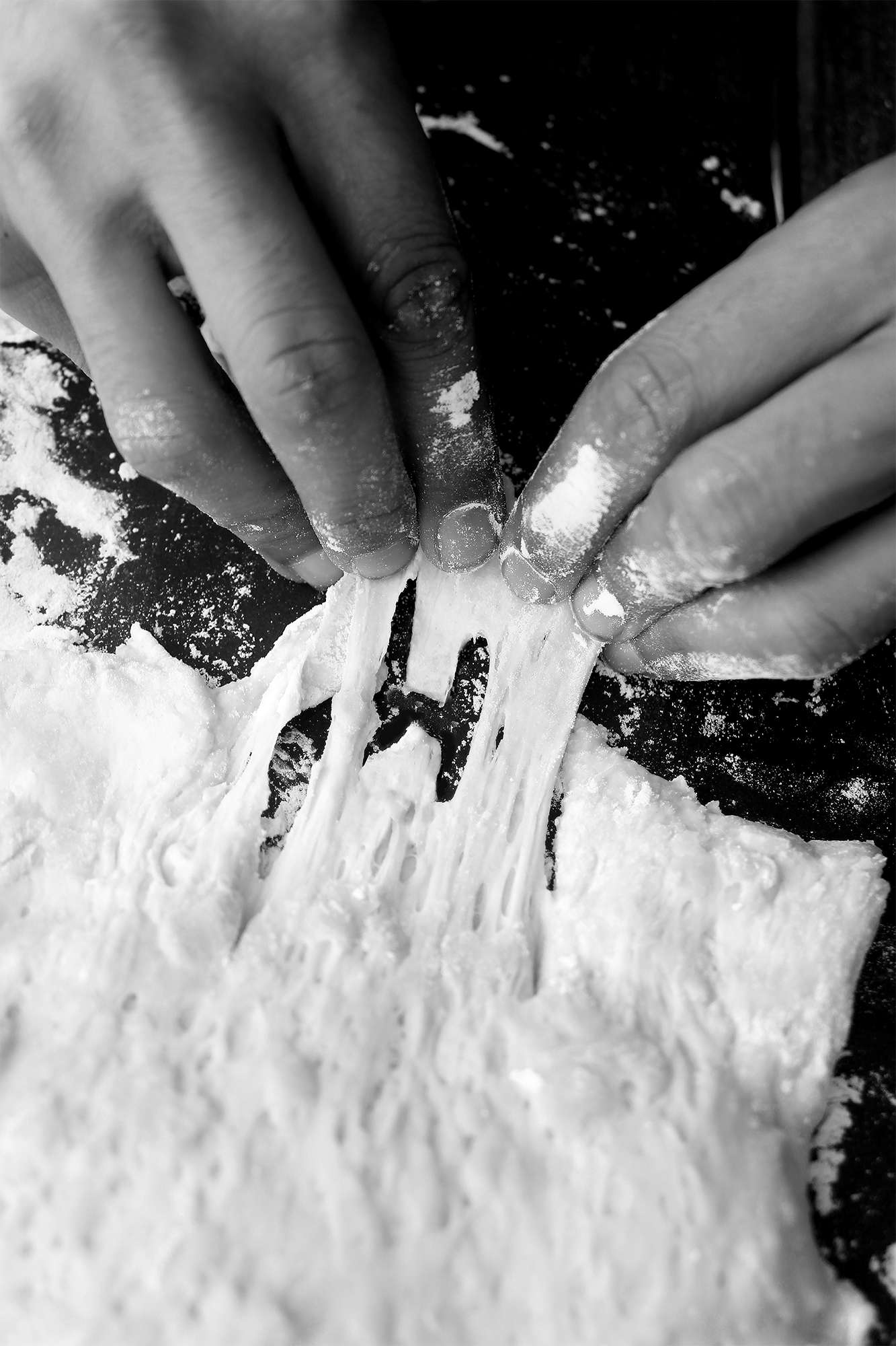
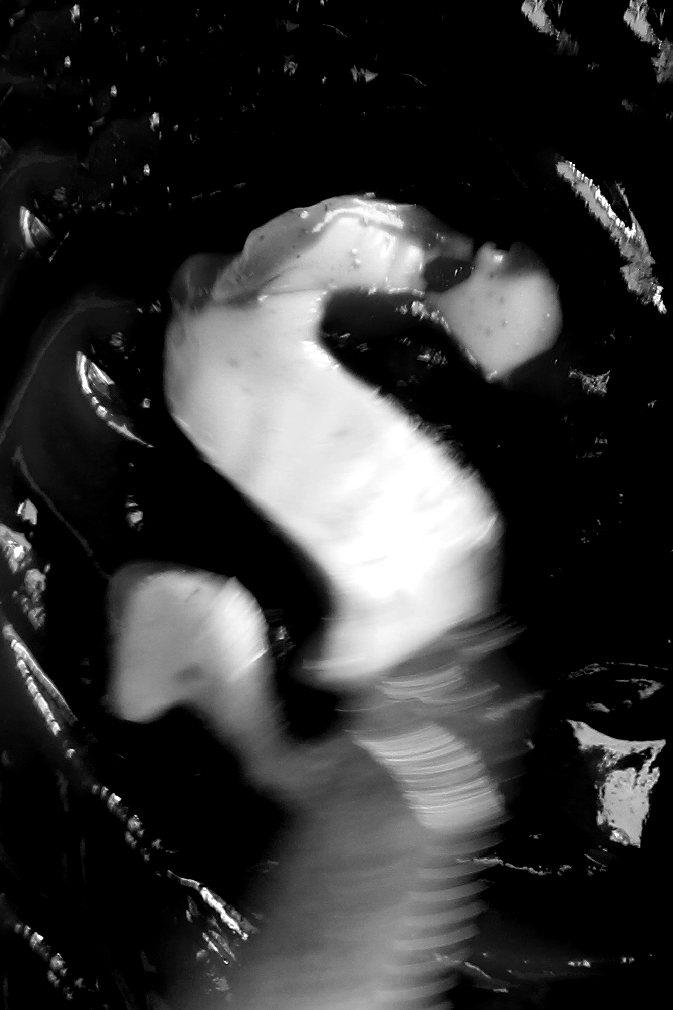
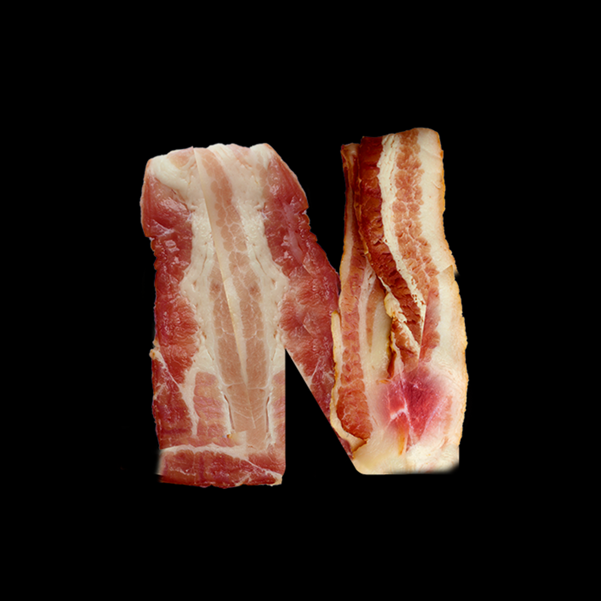
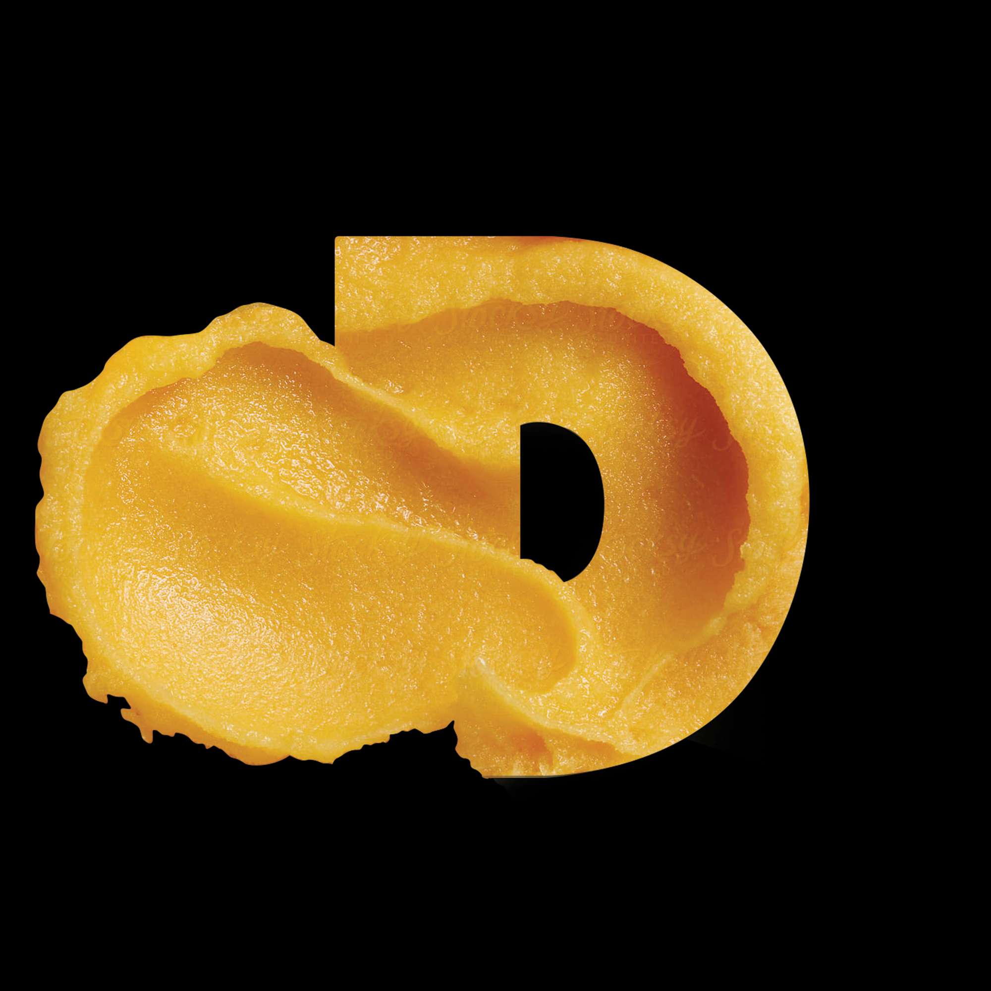
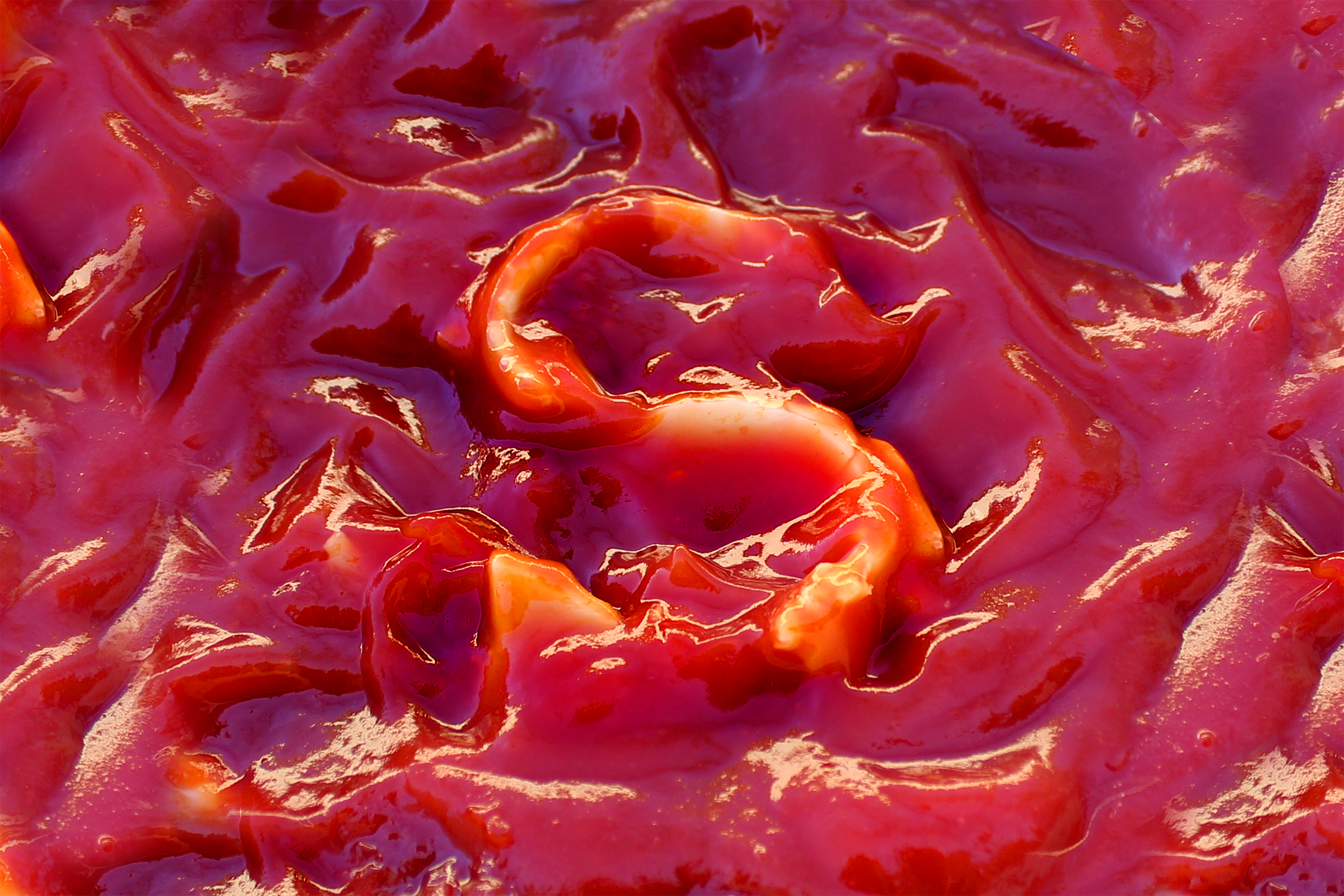
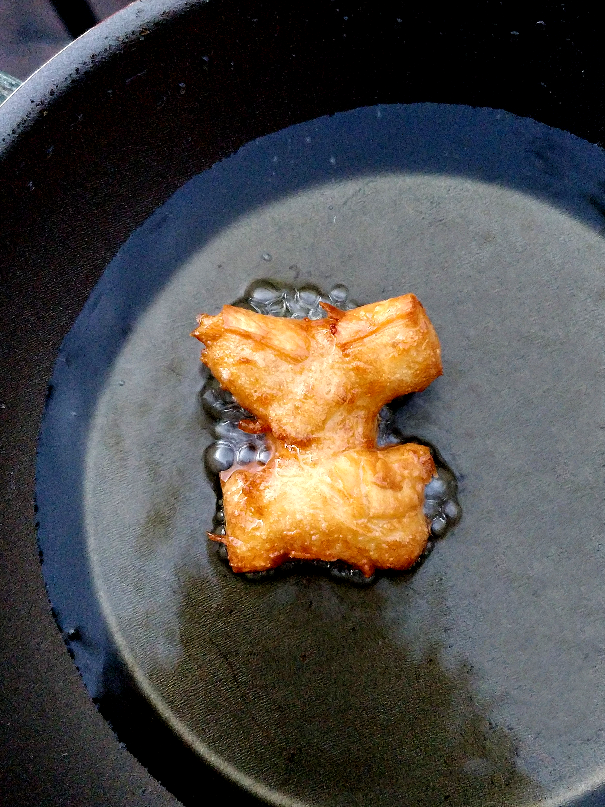
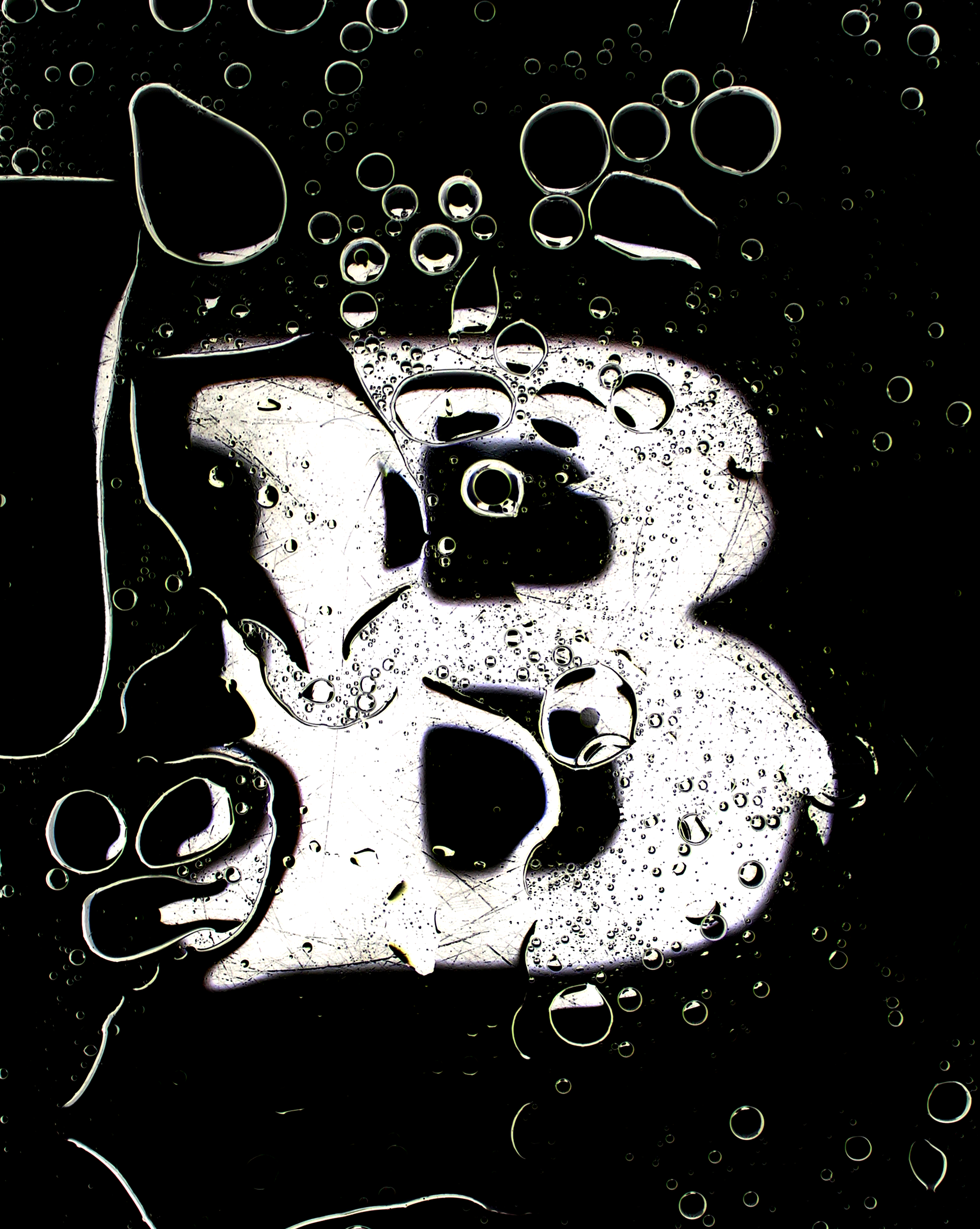
This direction takes inspiration from one of Wendy’s slogans: It’s Better Here.
Each alphabet has been crafted carefully to tell a story of the different cooking
techniques, and the process of preparing food.



Wendy’s – Newspaper Design
Providing context to the typographic experiments by composing them on a newspaper.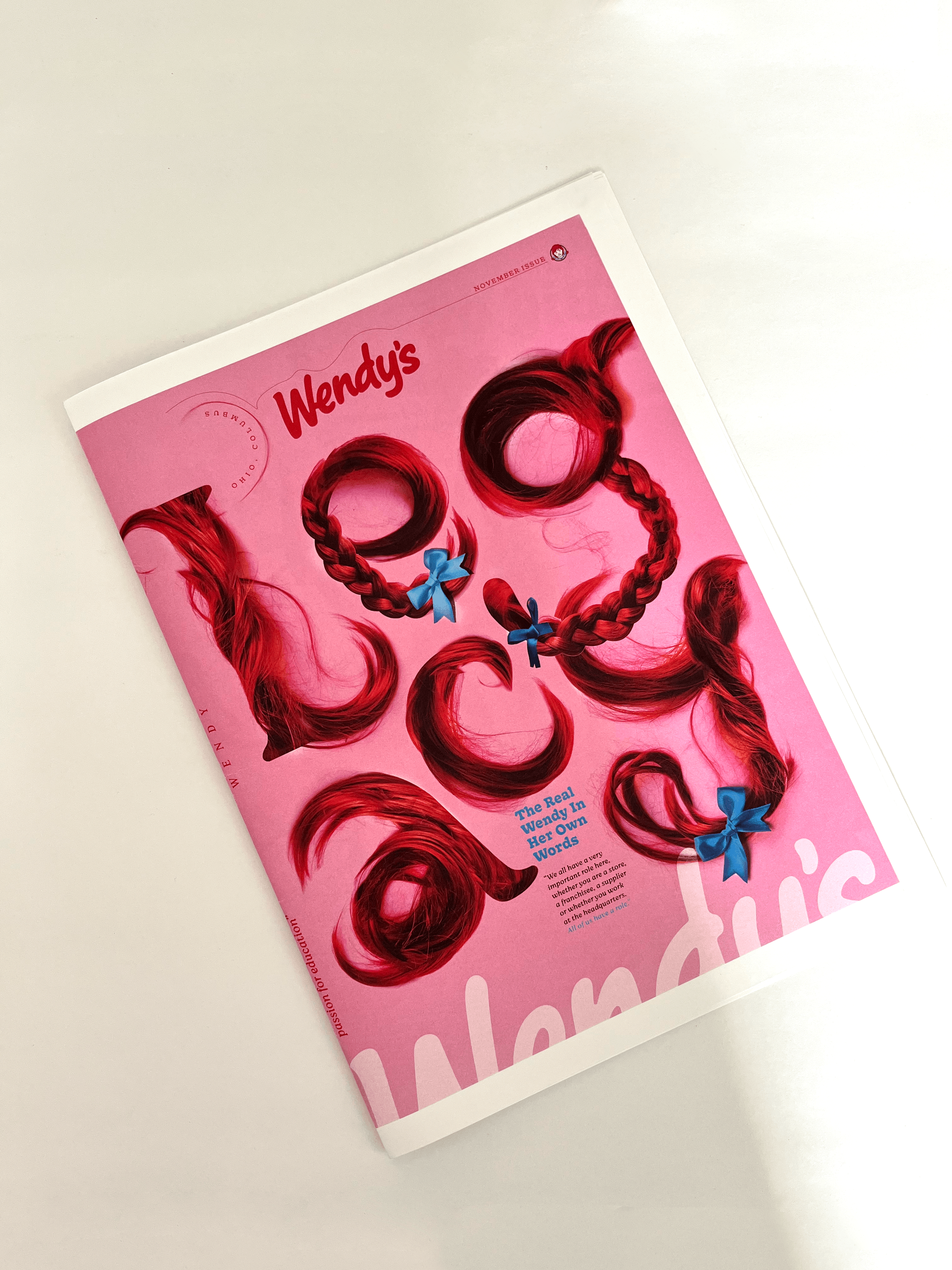




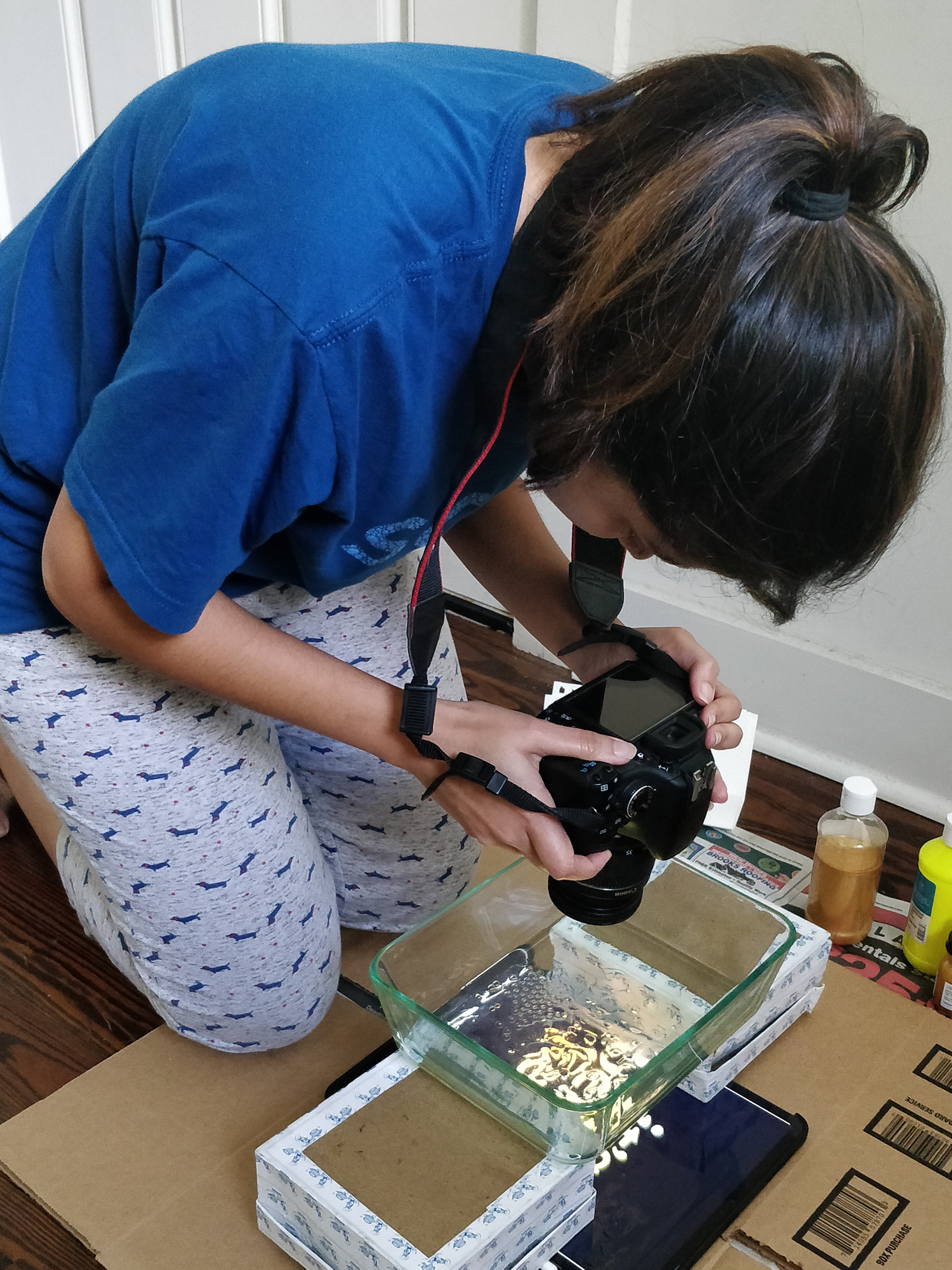
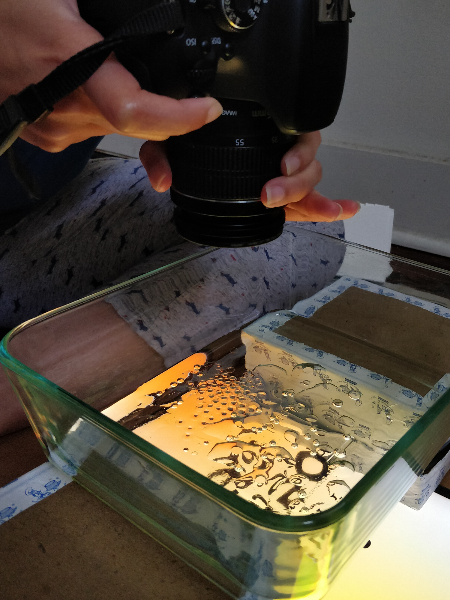
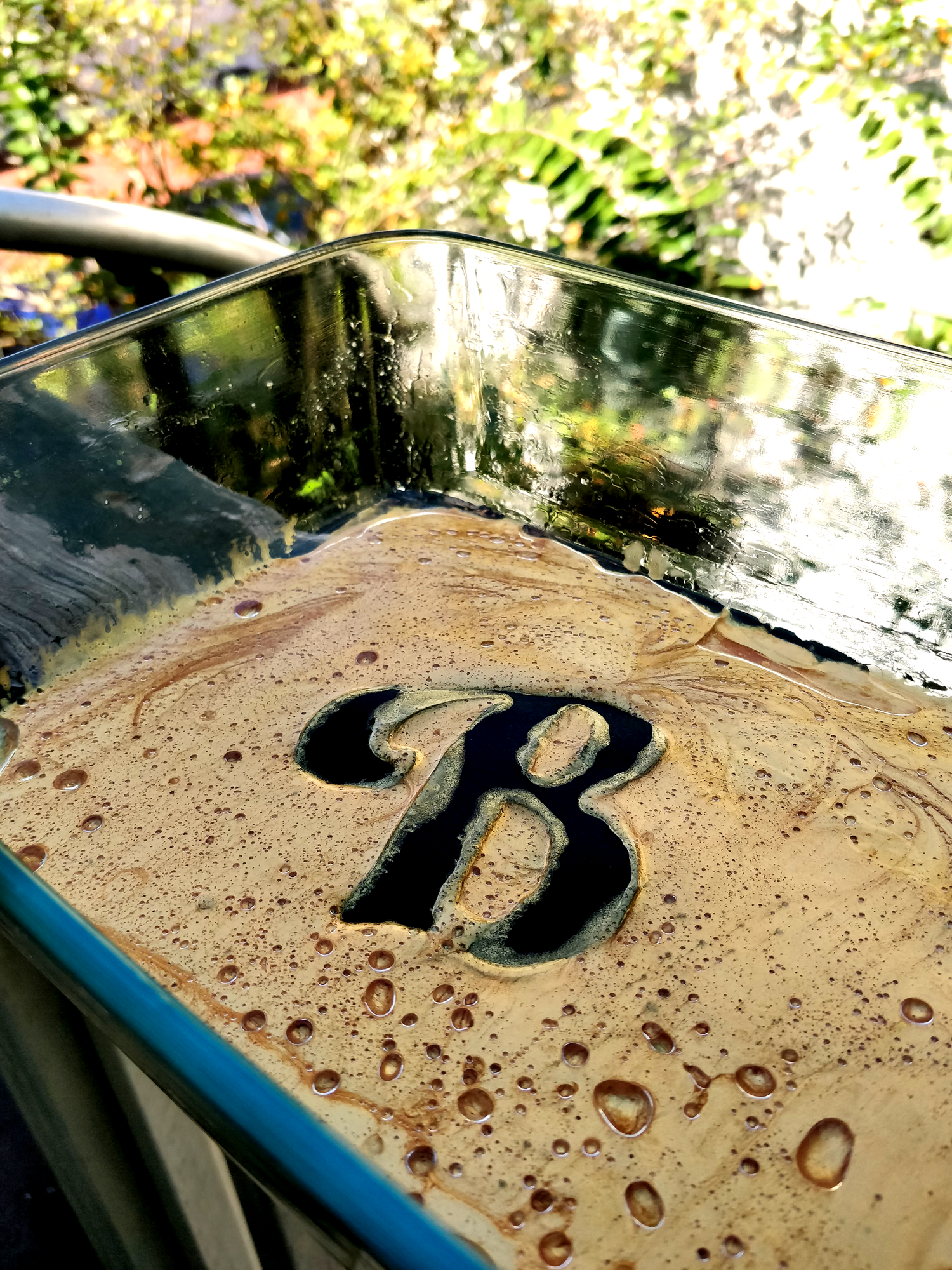
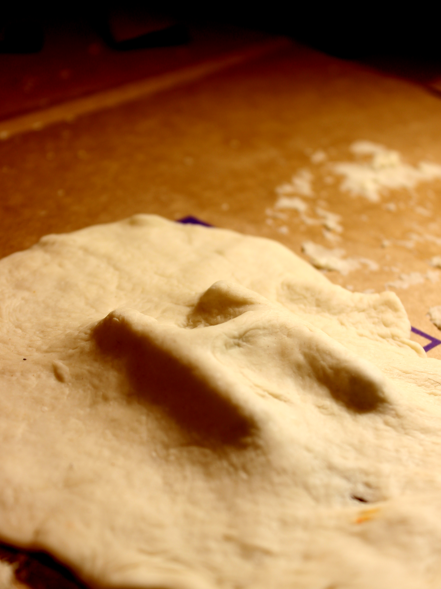
Behind The Scenes
Wenda
Legacy
America’s Favorite Breakfast
It’s Better Here


